Why colours are so important when branding your business
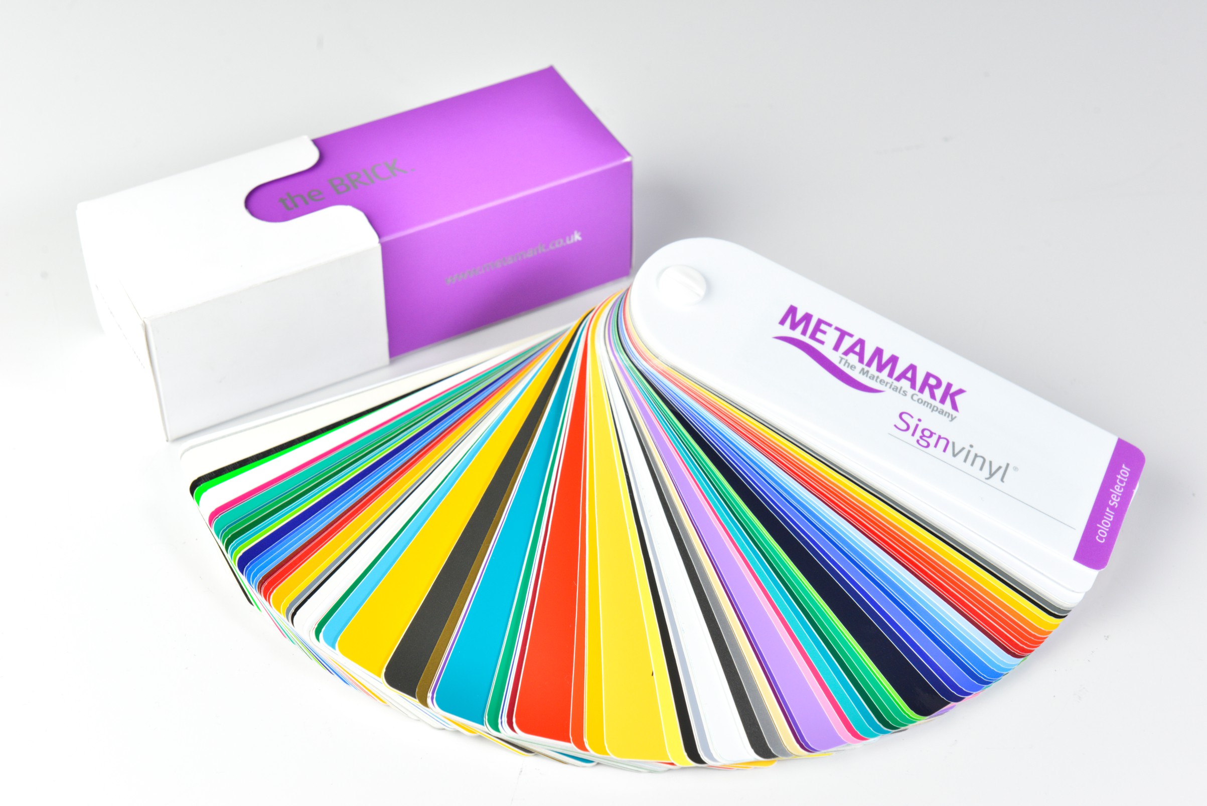
Colour plays a very important role in marketing and will be reflected through a company in their logo, branding and signage. Colour creates the first impression for a customer, and it creates an identity for a business. Colours in branding are more than just a visual aid, they show feelings, emotion and a particular experience, all in one glance.
Colours increase brand recognition by up to 80%! A great example of instant brand recognition by colour is McDonald’s. They are known for their famous red and yellow colour scheme which is present in their branding all around the world. When these two colours are together, you can’t help but think of McDonald’s and their big golden arches.
Psychology of colours
Colours pass small and subtle messages to people when they see a brand logo or sign. Lots of research has been done into the impact that different colours have on people and how it makes them feel. For example, warm colours like orange and red have been shown to make people feel hungrier, so they are often used in restaurant branding.
The shades of colours also project a message to customers.
Bright – Bright and bold primary colours can often come across as child friendly and appeal to a young audience. This gives a brand a family feel.
Pastel – Pastels are seen as feminine and soft, so this may appeal to more women and is usually used in branding and packaging for women’s items like perfumes.
Dark – On the other hand dark colours like burgundy and navy are more masculine and give a sense of traditionalism.
Neon – Neon colours can project young and trendy, appealing to young adults and teenagers.
The meanings of colours
There is no specific way colour is meant to make you feel. Sometimes, some people take comfort in the colour red whereas some people find it dangerous. However, most colours project the same meanings to the majority of people. Below is a range of colours and their universally perceived meanings.
Red – Red is a very strong colour. It can be used aggressively, energetically or provocatively. Red can be used to incorporate energy and passion into a brand.
Blue – Blue can be seen as trustful, secure and responsible. It is also associated with serenity and creation. You will find that lots of banks and businesses use the colour blue in their branding and this is down to the trust that it projects to their customers.
Green – Green is used in a variety of branding, and this is because it is a very positive colour. Green is a symbol of nature and health and radiates calming energy, especially in the lighter shades.
Yellow – This colour projects optimism and vibrancy. It can be captivating and motivating and that is why it can sometimes be seen on price tags, so it grabs the attention of shoppers.
Pink – Lighter shades of pink project a romantic vibe whereas darker shades of pink show excitement and energy.
Purple – Purple provides nostalgia, royalty, sophistication and exclusivity, making it great for businesses selling expensive jewellery.
Orange – Orange can be a good branding colour to use for children. This is because orange is friendly, cheerful and gives off fun vibes.
Brown – Brown is down to earth and gives off stability and simplicity.
White – White can look quite plain but when it is used in branding, it can offer cleanliness and purity which can be enticing.
Black – Black is a classic colour and screams exclusivity and sophistication. This serious colour works well to show customers that a brand is high-end and luxurious.
Where are brand colours used?
When a company picks out their colour for their branding, they have to consider a range of factors. Will the colours look good in a uniform? Will the colours look good on large signage? What products do they sell, and will the colours work with the product packaging? Will the colours look good on a website? What about office décor? Colours are much more than just a logo, they are a brand, and it will be used everywhere, so lots of thought has to go into it.

Nobody reads emails, and marketing is hard!
Who knew giving money away would be so tricky...

Prototyping in Progress
At Ashby, we believe good signage starts with thoughtful design. Our latest in-house project explores how slimmer profiles and advanced lighting can reshape what’s possible.
Ashby Recognised as an Approved Fabricator for Perspex®
A circular economy for acrylics and aluminium composites
Contact
- 0118 981 5343
 07931 873 706
- sales@ashbytrade.co.uk
- Ashby Trade Sign Supplies Ltd
- Basingstoke
- Hampshire
- RG24 7NG