The best fonts for signage
With thousands of fonts to choose from, it can be hard to decide which font you should use for your printed signs and banners. It can be tempting to pick a fancy font to stand out, but there is a reason why similar fonts are used for text on signage. With signage, readability is a top priority because if it is good looking but hard to read, the message you want to portray will get lost.
What to consider when choosing a font
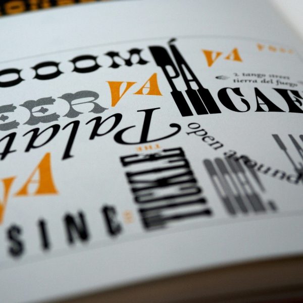
Serif & sans serif – A serif is a small flick on a letter to create a flow from letter to letter. Serif fonts have been around for much longer in texts than their more modern counterpart sans serif. Sans serif fonts are more commonly used due to their readability and clarity on screen, but serif fonts are slowly becoming more popular for signage.
If your signage features both a body of text and header that need to go together, a classic way to pair the two types of font is to use sans serif for the header and serif for the body of text. Despite this, some designs featuring the reverse of font types can still be very impactful.
Number of fonts – For signage it is best to stick to a maximum of two font styles otherwise it can become unprofessional and cluttered.
Colour palette – Contrasting colours are the best combination when it comes to signage to avoid any clashing or difficulty reading. If you have a lighter coloured background then use a darker colour for the font and if you have a darker colour background, use a lighter colour for the font. The colours can be adapted to fit with the business’s brand colour palette, but contrasting is key.
Top fonts for signage
Helvetica (sans-serif) – Helvetica is a very appropriate font for professional business use. It is a classic font which most likely won’t stray far from any branding style guides and can help to catch the attention of pedestrians as well as those driving. This font can even be used indoors for directional signage and the bold and simple characteristics of this font will help it stand out.
Trajan (serif) – Trajan is a unique and old-style font based on Roman square capitals. This font is an all-capitals font and makes a bold statement whilst setting a business apart from competitors. This font is best paired with a natural and sophisticated colour palette.
Futura (sans-serif) – Futura is a modern and geometric font which is easy to be read from a distance. By using the right colouring this clean and professional lettering is a cohesive font for many brands. The bold lines also make this font easy to spot on outdoor and indoor signage.
Optima (sans-serif) – Optima is a light and more feminine font which still makes an impact. This works great for both indoor and outdoor signage and has a nice variation of line weight through the letters. Optima is great for headlines of banners and large signage when paired with a contrasting colour palette.
Bodoni (serif)– Bodoni is lettering which is slightly less harsh but still bold and readable. This font flows from thick to thin and is extremely stylish when used with other simpler fonts for bulk text. Bodoni works great for banners and signboards whilst remaining slick and professional.
With thousands of fonts to choose from, it can be hard to decide which font you should use for your printed signs and banners. It can be tempting to pick a fancy font to stand out, but there is a reason why similar fonts are used for text on signage. With signage, readability is a top priority because if it is good looking but hard to read, the message you want to portray will get lost.
What to consider when choosing a font
Serif & sans serif – A serif is a small flick on a letter to create a flow from letter to letter. Serif fonts have been around for much longer in texts than their more modern counterpart sans serif. Sans serif fonts are more commonly used due to their readability and clarity on screen, but serif fonts are slowly becoming more popular for signage.
If your signage features both a body of text and header that need to go together, a classic way to pair the two types of font is to use sans serif for the header and serif for the body of text. Despite this, some designs featuring the reverse of font types can still be very impactful.
Number of fonts – For signage it is best to stick to a maximum of two font styles otherwise it can become unprofessional and cluttered.
Colour palette – Contrasting colours are the best combination when it comes to signage to avoid any clashing or difficulty reading. If you have a lighter coloured background then use a darker colour for the font and if you have a darker colour background, use a lighter colour for the font. The colours can be adapted to fit with the business’s brand colour palette, but contrasting is key.
Top fonts for signage
Helvetica (sans-serif) – Helvetica is a very appropriate font for professional business use. It is a classic font which most likely won’t stray far from any branding style guides and can help to catch the attention of pedestrians as well as those driving. This font can even be used indoors for directional signage and the bold and simple characteristics of this font will help it stand out.
Trajan (serif) – Trajan is a unique and old-style font based on Roman square capitals. This font is an all-capitals font and makes a bold statement whilst setting a business apart from competitors. This font is best paired with a natural and sophisticated colour palette.
Futura (sans-serif) – Futura is a modern and geometric font which is easy to be read from a distance. By using the right colouring this clean and professional lettering is a cohesive font for many brands. The bold lines also make this font easy to spot on outdoor and indoor signage.
Optima (sans-serif) – Optima is a light and more feminine font which still makes an impact. This works great for both indoor and outdoor signage and has a nice variation of line weight through the letters. Optima is great for headlines of banners and large signage when paired with a contrasting colour palette.
Bodoni (serif)– Bodoni is lettering which is slightly less harsh but still bold and readable. This font flows from thick to thin and is extremely stylish when used with other simpler fonts for bulk text. Bodoni works great for banners and signboards whilst remaining slick and professional.
Nobody reads emails, and marketing is hard!
Who knew giving money away would be so tricky...

Prototyping in Progress
At Ashby, we believe good signage starts with thoughtful design. Our latest in-house project explores how slimmer profiles and advanced lighting can reshape what’s possible.
Ashby Recognised as an Approved Fabricator for Perspex®
A circular economy for acrylics and aluminium composites
Contact
- 0118 981 5343
 07931 873 706
- sales@ashbytrade.co.uk
- Ashby Trade Sign Supplies Ltd
- Basingstoke
- Hampshire
- RG24 7NG