Size Really Does Matter ……and we can help with that
Yes, it’s true. The size of your letters is directly related to readability, but that’s not the only factor in how successful a sign will be.
Just because the lettering is big does not necessarily mean it is easy to read. In fact, there are in fact 4 factors to be considered:
Font style
As a rule, thinner letters are harder to read at a distance. Even if they are tall, too thin and they won’t be readable. Simple fonts are clearer.
White space
The white space around the lettering is an important factor. It gives the lettering space and contrast – great for readability
Kerning
The space between letters is as important as the type height. Large letters that are too close together won’t work.
Ashby Options – Viewing Distances & Type Sizes
Colour and contrast
A high contrast in colours on signage designed for viewing at a distance helps enormously with readability.
Where’s it going to be?
Location, location, location – the position of the sign and the necessary viewing distances need to be considered.
Getting it right
To help you we have created a guide for text heights and viewing distances. Bear in mind that there will be variances of text styles, colours and contrasts and so these are average sizes for sans serif typefaces.
Nobody reads emails, and marketing is hard!
Who knew giving money away would be so tricky...
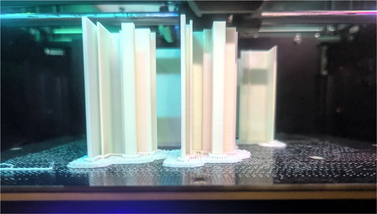
Prototyping in Progress
At Ashby, we believe good signage starts with thoughtful design. Our latest in-house project explores how slimmer profiles and advanced lighting can reshape what’s possible.
Ashby Recognised as an Approved Fabricator for Perspex®
A circular economy for acrylics and aluminium composites
Contact
- 0118 981 5343
 07931 873 706
- sales@ashbytrade.co.uk
- Ashby Trade Sign Supplies Ltd
- Basingstoke
- Hampshire
- RG24 7NG